Material Design
Build beautiful, usable products faster. Material Design is an adaptable system—backed by open-source code—that helps teams build high quality digital experiences.
material.io
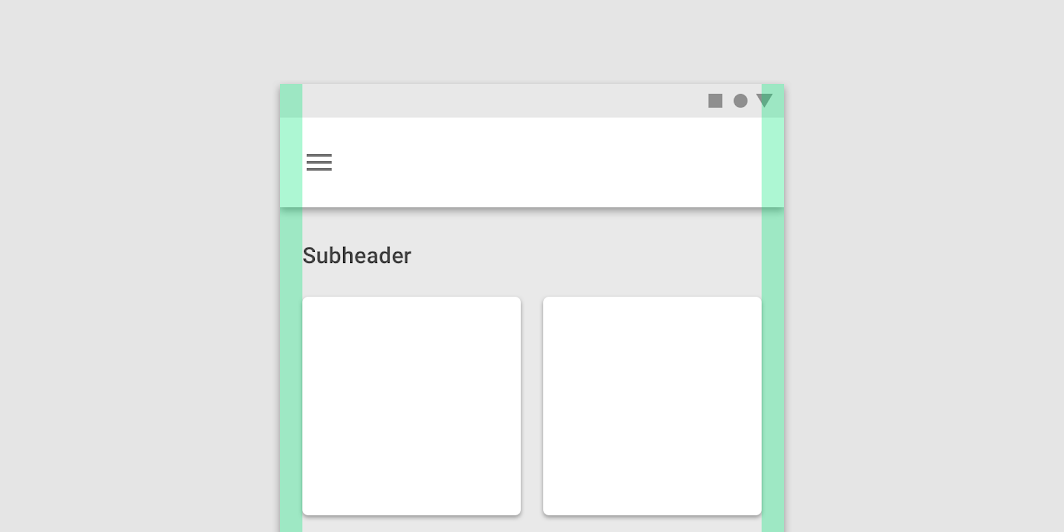
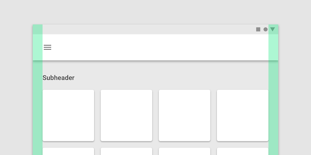
The Material Design responsive layout grid adapts to screen size and orientation, ensuring consistency across layouts.
레이아웃 그리드는 화면 크기와 방향에 맞춰, 레이아웃 전체에 일관성을 유지합니다.
Why? 왜 일관성을 유지시켜 주는 게 좋을까
Google Material에 따르면, 아래와 같은 이유가 있다.
일관성을 유지시켜준다.
반응형 디자인의 경우, 해상도 대응이 쉬워진다.
Columns
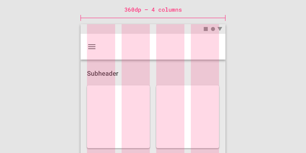
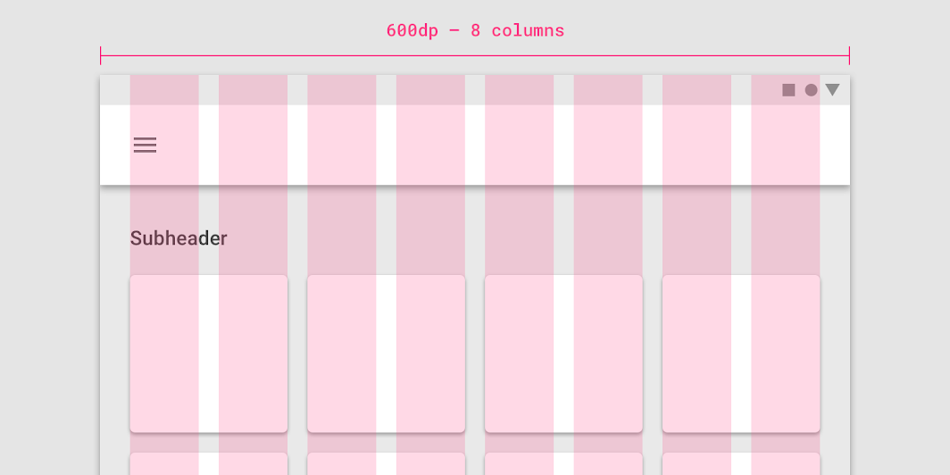
Gutters
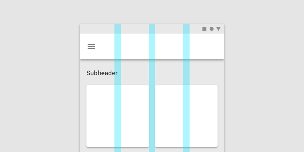
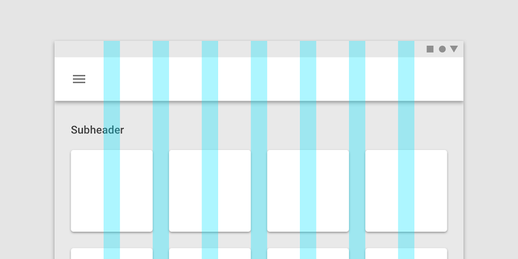
Margins
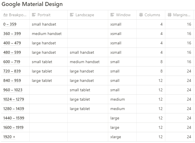
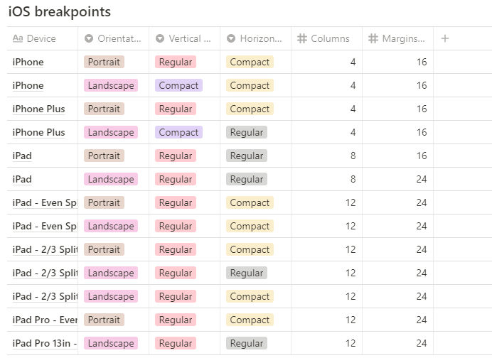
Breakpoint System
: 특정 지점을 기준으로 화면의 레이아웃이 바뀌는 지점을 말한다.
참고 문헌
'IT > 🎨디자인' 카테고리의 다른 글
| Windows 앱 디자인(PC) 메뉴얼 (0) | 2021.07.05 |
|---|---|
| 인쇄 팁 (0) | 2021.06.17 |
| 면적대비 (0) | 2021.05.16 |
| Figma, GoogleSheetsSync, Window Console를 통한 단순 반복 업무 자동화 (4) | 2021.05.08 |